Trade show banners are among the most effective ways to draw attention to your booth and brand during a trade event. With countless competitors vying for attention, the design of your banner could be the deciding factor in whether attendees stop by. A well-designed banner can help communicate your message clearly, showcase your products or services, and increase the likelihood of connecting with potential customers.
Why Design Matters at Trade Shows
The competition at trade shows can be fierce, with thousands of brands competing for the same audience. A poorly designed banner can easily be overlooked, even if you have the best products or services. Designing a banner that catches the eye, clearly communicates your message, and stands out from the crowd is essential.
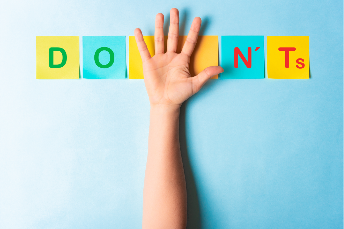
The Do’s of Designing Trade Show Banners
Do Use a Clear and Concise Message
A key principle of effective banner design is clarity. Trade show banners are not the place for long-winded explanations or detailed product descriptions.
Keep Text Short and Sweet
Opt for short, impactful phrases that can quickly convey what you offer. Attendees should be able to understand your core message in a matter of seconds. For example, using phrases like “Innovation in Every Sip” for a beverage company or “Your Next Home Starts Here” for real estate works far better than a long sentence.
Focus on Key Points
Highlight your unique selling points (USPs) with bullet points or simple statements. This makes it easier for people to quickly understand your brand.
Do Use Bold, Readable Fonts
Choosing the right font is essential for making your message stand out. Opt for bold, sans-serif fonts that are easy to read from a distance. Avoid using overly decorative fonts that can be difficult to decipher in a busy trade show environment. The font should complement your overall branding and help reinforce the clarity of your message. Keeping the text legible ensures that potential customers can absorb key information without straining their eyes.
Do Make Your Branding Stand Out
Your banner is a reflection of your brand. It’s crucial to make sure it aligns with your overall branding to reinforce recognition.
Consistent Brand Colors
Use your company’s colors throughout your design. This helps create a consistent visual identity across all your marketing materials and makes your booth instantly recognizable.
Use the Right Logo Placement
Your logo should be prominent on the banner but not overpowering. It should be visible at eye level, ensuring that people can easily connect your brand to the messaging on the banner.
Do Choose High-Quality Materials
The durability and quality of your banner can say a lot about your business.
Durable Fabric vs. Vinyl
Vinyl banners are durable and offer a shiny finish, while fabric banners give off a more refined, professional look. Depending on the nature of your event and booth space, choose the material that best represents your brand’s image.
Consider the Venue Environment
Consider whether your banner will be exposed to wind, sunlight, or moisture. Choose materials that will last throughout the event and look fresh even after a long day on display.
Do Use Legible Fonts and Clear Contrast
You want your banner to be legible from a distance. When selecting fonts and color schemes, remember that clarity should always come first.
Font Size and Style Tips
Ensure that your text is large enough to read from across the room. Choose fonts that are simple, bold, and easy to read—think Arial or Helvetica instead of ornate script fonts.
Ensure High Contrast for Visibility
Use contrasting colors to make your text pop. For example, white text on a dark background is easier to read from a distance than light text on a light background.
Do Incorporate Eye-Catching Graphics
Visual elements, such as images or graphics, can enhance the appeal of your banner and draw attention.
Graphics That Tell Your Story
Use graphics that relate to your product or service. Visuals can explain your message in a way that text cannot. However, be sure that the images align with your brand and avoid cluttering the space.
Minimalism vs. Overcrowding
Keep your graphics simple. Overloading the banner with too many images can dilute the message. Focus on a few key elements that communicate your story effectively.
The Don’ts of Designing Trade Show Banners
Don’t Overload with Information
Too much information can overwhelm attendees and turn them away. Remember, trade show banners are for quick communication.
Avoid Clutter and Long Paragraphs
Stay away from paragraphs of text. Use bullet points and concise descriptions instead.
Focus on a Single Message
Your banner should focus on one core message or value proposition. Trying to convey multiple messages at once can confuse potential customers.
Don’t Use Hard-to-Read Fonts
While fancy fonts can be appealing, they’re not always practical for banners.
Avoid Fancy Fonts for Key Messages
Avoid using intricate fonts for your banner’s main text. Choose simple, bold, and legible fonts to ensure readability from a distance.
Consider Readability from a Distance
A banner that looks good up close but is hard to read from across the room defeats its purpose. Always test your design to ensure it’s legible from a distance.
Don’t Neglect the Size of Your Banner
The size of your banner is essential to its effectiveness. Too large or too small can lead to issues with visibility and impact.
Proper Sizing for Your Booth
Make sure the size of your banner fits well within your trade show booth space. A banner that’s too large can feel overwhelming, while one that’s too small may not stand out.
Adjust Banner Size Based on Space
If you have limited space, consider smaller banners that still make a bold impact, such as retractable banners or hanging signs.
Don’t Forget to Proofread
Typos and grammatical errors can give a bad impression.
Importance of Spelling and Grammar
Make sure all text is checked for spelling, grammar, and punctuation errors. Even a small mistake can make your brand look unprofessional.
Common Mistakes to Avoid
Double-check the spelling of your company name, contact information, and any key product names to ensure accuracy.
Don’t Use Too Many Colors
Using too many colors can confuse viewers and make the banner look cluttered.
Too Many Colors Can Distract
Stick to two or three primary colors. Too many hues can make your design look chaotic and lose the impact you’re aiming for.
Stick to Your Brand’s Color Palette
Choosing colors that complement your brand’s identity ensures consistency and helps with brand recognition.
Designing trade show banners is more than just slapping a logo on a backdrop. It’s about creating a design that resonates with your audience, showcases your brand effectively, and communicates your message clearly. By following the do’s and avoiding the don’ts, you can ensure your banner makes a lasting impression.
Remember, simplicity and clarity are key. With the right design elements, your banner can draw in attendees, boost your brand recognition, and help you make meaningful connections at your next trade show.

Stevan Stabelin is a passionate writer and expert in the Banners and Signs niche, dedicated to helping businesses and individuals create impactful visual displays. Through his blog, he shares practical tips, design insights, and marketing strategies for vinyl banners, LED signage, retractable displays, and digital printing. With a keen eye for branding and material selection, Stevan provides easy-to-follow guidance to help readers craft attention-grabbing signage that enhances visibility and engagement.